Image: courtesy JKR
While consumer-facing brands pay top dollar for logos that stand out in the marketplace, branding for B2B companies that sell things like cloud computing or cybersecurity tend to be reserved—and frankly, uninspiring. But the new visual identity for the data center company Centersquare flips that notion on its head proving that even “boring” companies deserve a stellar rebrand.
Centersquare, a Texas-based data center company, was formed earlier this year through the merger of the data center firms Cyxtera and Evoque. The original logos for the two companies weren’t anything to write home about (Evoque’s logo turned the “O” and “Q” in its name into an infinity symbol), but about what you’d expect for a company that sells space in server racks. The new company turned to the branding agency JKR for a more engaging visual identity.
“The question that we asked ourselves was why do brands have to be boring in this space?” Tosh Hall, JKR’s chief creative officer, tells Fast Company. “Our goal, of course, was how do you take a space that’s under serviced and a little bit boring or bland or whatever, and make it great”.
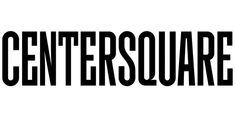
Data center logos tend towards designs that communicate security, with elements like locks and shields, or logos designed to look like a fortress. JKR created a word mark that played on the new company’s name, stacking the word “Center” on top of “Square,” which are (helpfully) both six letters. The two middle letters in both words are truncated, creating a square from the negative space in the middle that acts as a frame for a series of ever-changing, colorful data visualizations based on open-source data. “We’re ready to put your business at the center,” the company says on its website.
The logotype was created by Simon Walker, a custom letterer whose work has been featured on products like bottles of an Austin hard cider brand and the Barnes & Noble exclusive edition of The Color Purple, and it was meant to evoke stability within a dynamic structure, according to Centersquare.
The square is repeated throughout Centersquare’s visual identity, with custom icons based on square grids and isometric illustrations that turn cubes into colorful 3-D style shapes that are far more eye-catching than the terms they’re used to illustrate on the company’s website, like “colocation” and “interconnection.” The brand’s warm color palette was designed to look different from typical tech brands, and it describes its brand voice as “the seasoned professional”.
Centersquare’s new visual identity shows that even in the most unglamorous industries, companies can still benefit from branding that builds on the best practices of consumer-facing brands. As Hall puts it, “behind every B in the B2B are humans, so it’s not any different in our minds from B2C or consumer branding”.
Fonte fast Company
