[Screenshot: NY Times]
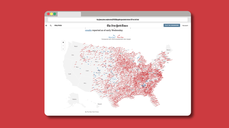
Early this morning, Republican candidate Donald Trump was elected president after a win in the swing state of Wisconsin tipped him over the threshold of 270 electoral college votes necessary to secure the post. To many Democrats—who were invigorated by the energy of Vice President Kamala Harris’s campaign and reported feeling more hopeful than their Republican counterparts—the results came as a shock. But a new map from The New York Times paints a striking picture of exactly why Harris ultimately lost.
The map, published by The New York Times using election results from 4 a.m. Wednesday morning, is a dense sea of right-facing red arrows, punctuated every so often by a small scattering of blue vectors. Each red arrow represents a U.S. county where Republicans gained ground in the 2024 election compared to the 2020 election, and the arrows’ lengths correlate to the magnitude of those gains. Overall, the map concisely illustrates an overwhelming nationwide shift to the right—literally and figuratively.
According to the NYT’s analysis of the counties with nearly complete election results, more than 90% shifted in favor of Trump in 2024. Some of the biggest gains were made in urban counties, counties with large populations between ages 18-34, and those that were less than 50% white—all areas that have historically performed better for Democrats. Unlike The Times’ needle graphic, which has become notorious for boiling election results down to one anxiety-inducing barometer, the arrow map format converts these micro-level trends into an easily-digestible portrait of the country’s increasingly red-leaning populace.
According to Wilson Andrews, deputy graphics editor at the NYT, the publication has been using arrows in various forms as a core election data visualization tool since the mid-2000s. From a broader perspective, he says, arrows are an ideal shape for election graphics because they can convey multiple variables in an instantly recognizable format.
“You can modify the length of the arrow, you can modify the size of the arrow head, you can change the color, and you can also change the direction,” Andrews says. “All of those are simple enough variables that you could tweak in the design that are still understood by most people.”
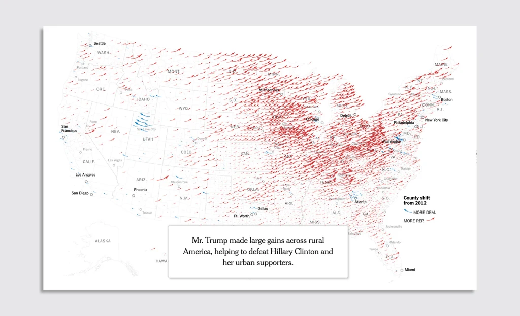
For American politics specifically, wherein left, right, blue, and red are interlinked, he says arrows can create a “strong visual metaphor of a political spectrum.” That became clear in 2016, when the NYT first debuted a live, interactive, arrow-based election map for the first time.

Since 2016, The Times has streamlined the shapes of its election map arrows to make them more legible, thickening the arrows, straightening the arrow paths, and slimming down the arrowheads.
While this year’s map will continue to be updated as results arrive (states like Washington, Oregon, and California, for example, aren’t well-represented yet), its results are already pretty stark. Back in 2020, a similar visualization showed a much more even distribution of Democratic and Republican gains. Even in 2016, when Trump won against Democratic candidate Hillary Clinton, Republicans’ largest gains were mainly attributable to rural counties, and remained more isolated to those areas.
“On the whole, the national map is pretty stunningly shifting to the right,” Andrews says. “I think that’s kind of the biggest early takeaway from this election, is just how widespread that voting pattern was.”


